On paper, everything looks fine.
Your dashboard is green. Sales are up. Activity levels are higher than last month. Your team is closing more deals than ever.
And yet—something feels off.
Renewals are dropping quietly in the background. Profit margins are not improving. Some “top performers” are constantly hitting targets, but the business as a whole doesn’t feel more stable.
This is one of the most common blind spots in insurance operations today: your sales metrics are not necessarily telling you the truth—they’re telling you a simplified version of reality.
And in insurance, simplification can be expensive.
A real-world scenario (that happens more often than you think)
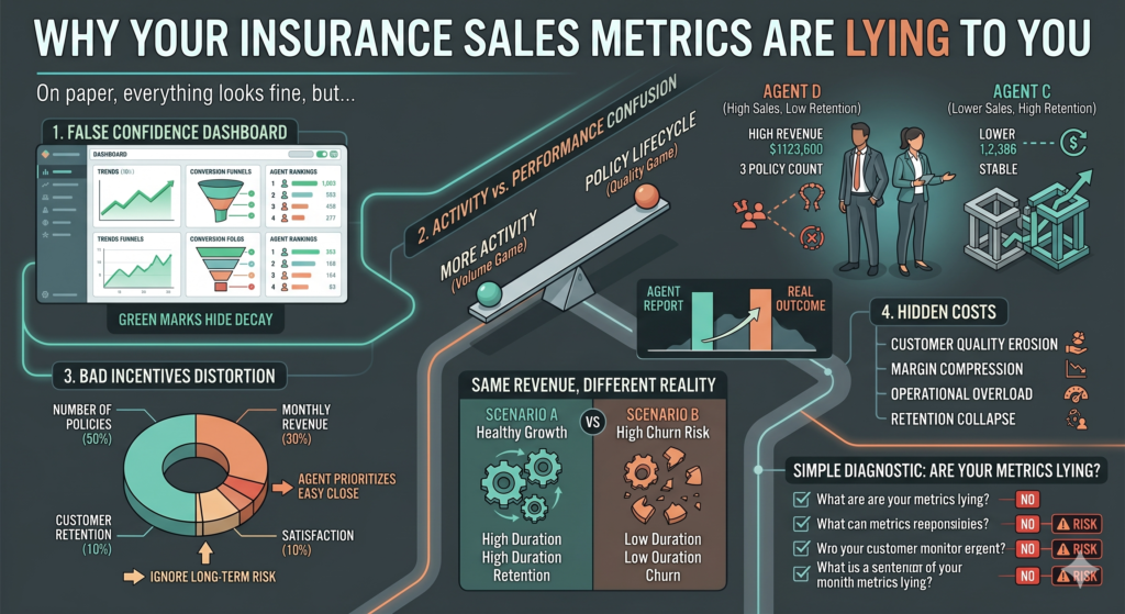
Imagine a mid-sized insurance agency with 12 sales agents.
At the end of the quarter, the report looks like this:
| Agent | Policies Sold | Revenue Generated | Renewal Rate | Average Premium |
|---|---|---|---|---|
| A | 58 | €42,000 | 61% | €730 |
| B | 51 | €39,500 | 58% | €780 |
| C | 49 | €41,200 | 72% | €840 |
| D | 63 | €44,100 | 55% | €690 |
| E | 46 | €38,700 | 75% | €860 |
At first glance, Agent D looks like a star performer: highest number of policies sold and top revenue.
But six months later, something unexpected happens:
- Client churn increases in Agent D’s portfolio
- Claims support tickets rise
- Renewal revenue drops significantly
- Customer satisfaction scores fall
Meanwhile, Agent C—who didn’t sell the most—ends up generating the most stable long-term revenue.
So what went wrong?
The metrics rewarded the wrong behavior.
The problem: we confuse activity with performance
Most insurance dashboards are built around one assumption:
More activity = better performance
But in reality, insurance sales is not a volume game—it is a lifecycle quality game.
Let’s break this down:
| Metric Type | What It Measures | What It Ignores |
|---|---|---|
| Policies Sold | Short-term output | Customer quality |
| Revenue Generated | Immediate income | Long-term retention |
| Conversion Rate | Funnel efficiency | Policy durability |
| Lead Volume | Sales activity | Lead relevance |
| Average Premium | Deal size | Risk quality |
When you only optimize for the left column, you often damage the right one without realizing it.
The invisible distortion: bad incentives
One of the biggest structural issues in insurance sales teams is incentive design.
Let’s look at a simplified example:
| KPI | Weight in Bonus System |
|---|---|
| Number of Policies Sold | 50% |
| Monthly Revenue | 30% |
| Customer Retention | 10% |
| Customer Satisfaction | 10% |
At first glance, this looks balanced.
But in practice, here’s what happens:
- Agents prioritize easy-to-close customers
- Long-term risk profiles are ignored
- Policies are structured for speed, not stability
- Retention becomes a secondary concern
The result is predictable:
You optimize for the metric you measure most—not the outcome you actually want.
Why dashboards create false confidence
Modern insurance platforms are extremely good at visualization.
They show:
- Growth trends
- Conversion funnels
- Agent rankings
- Monthly performance comparisons
But what they often fail to show is context decay.
For example:
- A 15% increase in sales might come from lower-quality leads
- A high conversion rate might come from aggressive discounting
- Revenue growth might be masking a drop in policy duration
Let’s illustrate this:
Example: Same revenue, different reality
| Scenario | Revenue | Avg Policy Duration | 12-month Retention | Real Outcome |
|---|---|---|---|---|
| A | €100,000 | 18 months | 82% | Healthy growth |
| B | €100,000 | 9 months | 54% | High churn risk |
Both scenarios look identical in a basic dashboard.
Only deeper metrics reveal the truth.
The hidden cost of “good-looking” numbers
When metrics are misaligned, the damage is slow but consistent.
1. Customer quality erosion
Sales teams prioritize easier customers over better ones.
2. Margin compression
Discounting becomes a shortcut to close more deals.
3. Operational overload
More clients = more claims = more support cost.
4. Retention collapse
Short-term sales spike, long-term revenue weakens.
A simple diagnostic: are your metrics lying to you?
You can test your system with this checklist:
| Question | If the answer is “no”, there is a risk |
|---|---|
| Do you track customer lifetime value per agent? | You may be optimizing short-term sales |
| Do you separate new revenue from retained revenue? | Growth may be misleading |
| Do you measure policy cancellation reasons? | You lack feedback loops |
| Do you compare premium vs risk quality? | You may be overpricing bad clients |
| Do incentives include retention performance? | You are rewarding incomplete performance |
If you fail more than two of these, your dashboard is likely incomplete.
What better metrics actually look like
A healthier insurance performance system usually includes:
| Category | Better Metric |
|---|---|
| Sales | Qualified policy acquisition rate |
| Revenue | Net retained revenue |
| Customers | Lifetime value per segment |
| Retention | 6–12 month renewal stability |
| Quality | Claims ratio per agent portfolio |
The key shift is simple:
Stop measuring only what happens at the moment of sale, and start measuring what happens after the sale.
The mindset shift that changes everything
Most insurance teams operate like this:
“How do we sell more this month?”
High-performing organizations operate differently:
“What kind of customers are we building for the next 12–24 months?”
This shift changes everything:
- Sales behavior
- Incentive structure
- Lead qualification
- Pricing strategy
- Customer experience
Final thought
The uncomfortable truth is this:
Your sales metrics are not wrong because the data is wrong. They are wrong because they are incomplete.
Insurance is not a transaction business—it is a time-based relationship business.
And when you only measure the first moment of that relationship, you risk optimizing for a version of success that doesn’t last long enough to matter.