It started like a success story.
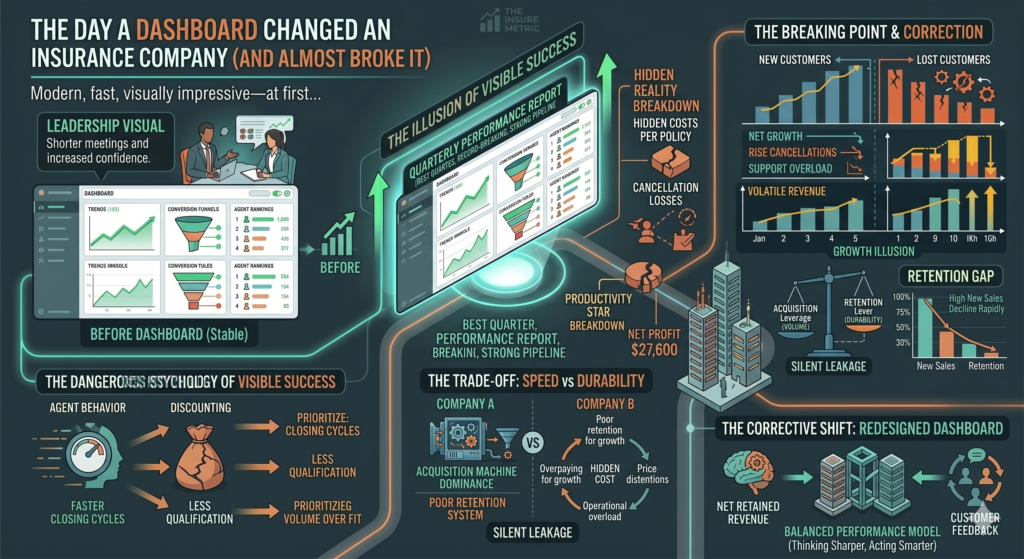
A mid-sized insurance company had just implemented a new analytics dashboard. It was modern, fast, and visually impressive. Leadership described it as a “single source of truth” for the entire organization.
For the first time, everyone could see:
- real-time sales performance
- agent rankings
- conversion funnels
- revenue progression
- pipeline forecasts
Meetings became shorter. Decisions became faster. Confidence increased.
At least, that’s what it looked like on the surface.
But within six months, something unusual started happening.
The numbers improved… while the business started feeling less stable.
The moment everything looked perfect
At first, the dashboard told a very clean story:
| Metric | Month 1 | Month 2 | Month 3 |
|---|---|---|---|
| New Policies | 1,200 | 1,350 | 1,500 |
| Revenue | €420,000 | €465,000 | €510,000 |
| Conversion Rate | 18% | 20% | 22% |
| Sales Activity | Rising | Rising | Rising |
Leadership interpreted this as clear success.
There were internal emails celebrating:
- “best quarter in company history”
- “record-breaking agent performance”
- “strong pipeline health”
The dashboard was working exactly as intended.
Or so it seemed.
The first cracks: what the dashboard didn’t show
While leadership focused on acquisition metrics, another set of numbers was quietly moving in the opposite direction:
| Hidden Metric | Month 1 | Month 2 | Month 3 |
|---|---|---|---|
| 60-day cancellations | 8% | 11% | 15% |
| Support tickets | Rising | Rising | Rising |
| Renewal intent (survey) | 78% | 71% | 63% |
| Complaint rate | Stable | Increasing | Increasing |
But these weren’t on the main dashboard view.
They were hidden behind tabs, secondary reports, or not tracked with the same visibility.
And that’s where the problem started.
The dangerous psychology of “visible success”
Once the dashboard was introduced, behavior inside the company began to change.
Not intentionally.
Systematically.
Sales teams adapted first
Agents quickly learned what was being measured:
- policies sold
- monthly revenue
- conversion rate
So they optimized for those.
That meant:
- faster closing cycles
- more aggressive discounting
- less customer qualification
- prioritizing volume over fit
The dashboard didn’t explicitly tell them to do this.
But it rewarded it.
The hidden trade-off: speed vs durability
Insurance is not a short-cycle business. Every policy has a lifecycle:
- Acquisition
- Activation
- Stability
- Renewal
- Retention or churn
The dashboard, however, focused heavily on stage 1 and 2.
So the organization started optimizing the beginning of the funnel while ignoring everything after it.
Let’s simplify the impact:
| Funnel Stage | Before Dashboard | After Dashboard |
|---|---|---|
| Acquisition speed | Moderate | Very high |
| Customer quality | High | Lower |
| Retention | Stable | Declining |
| Profit per client | High | Falling |
This is a classic systems problem:
You optimize what you measure, not what matters.
The illusion of better performance
By month six, the dashboard showed:
| Metric | Value |
|---|---|
| New policies | +38% YoY |
| Revenue | +29% YoY |
| Conversion rate | +5% improvement |
| Agent productivity | Record highs |
On paper, this was outstanding performance.
But internally:
- margins were shrinking
- churn was increasing
- operational workload was growing
- customer satisfaction was declining
The system was producing more output—but less value.
The breaking point nobody expected
The real problem became visible only when renewal season arrived.
A large portion of the “high-performing” policies started dropping off:
| Segment | Renewal Rate Before | Renewal Rate After Dashboard |
|---|---|---|
| Low-discount policies | 82% | 78% |
| Medium-discount policies | 74% | 61% |
| High-discount policies | 68% | 49% |
The company had unknowingly shifted its portfolio toward lower-quality risk profiles.
Why?
Because the dashboard rewarded speed, not stability.
What the dashboard was actually optimizing for
Even though leadership believed they were tracking “performance,” the system was effectively optimizing for:
- fastest conversion time
- highest short-term revenue
- largest volume of new policies
What it was not optimizing for:
- long-term retention
- customer risk quality
- margin stability
- lifecycle profitability
And in insurance, those missing elements are everything.
The cost of misaligned visibility
Once the effects compounded, three major issues emerged:
1. Revenue instability
Growth became unpredictable due to higher churn volatility.
2. Rising acquisition dependency
The company needed more and more new customers just to maintain revenue levels.
3. Operational overload
Support teams were overwhelmed with:
- cancellations
- complaints
- policy adjustments
The system was no longer scaling cleanly.
A simple comparison that reveals the problem
Let’s compare two versions of the same company:
Before dashboard optimization
| Metric | Value |
|---|---|
| New policies/month | 1,000 |
| Retention rate | 80% |
| Net margin | High |
| Support load | Moderate |
After dashboard optimization
| Metric | Value |
|---|---|
| New policies/month | 1,400 |
| Retention rate | 63% |
| Net margin | Lower |
| Support load | High |
The second version looks better in a sales report.
But worse in a business report.
Why dashboards create unintended behavior shifts
Dashboards don’t just display reality—they shape it.
This happens because:
1. Measurement becomes motivation
People naturally focus on what is visible and rewarded.
2. Simplification hides complexity
Complex systems get reduced into a few KPIs.
3. Rankings create competition bias
Agents optimize for rank, not system health.
Over time, this creates a feedback loop:
What gets measured gets optimized. What gets ignored deteriorates.
What the company eventually realized
After the damage became visible, leadership ran a deeper analysis.
They discovered something critical:
- The best-performing agents by dashboard metrics were not the most profitable
- The fastest-growing segments had the worst retention
- The most aggressive sales behavior correlated with higher churn
In other words:
The dashboard was not wrong—it was incomplete.
The corrective shift that changed everything
The company didn’t remove the dashboard.
They redesigned it.
They added:
- Net retained revenue
- 6–12 month cohort retention
- Profit per policy
- Cancellation reason breakdown
- Customer lifetime value by agent
And most importantly:
- retention metrics were given equal weight to acquisition metrics
The outcome after correction
Within two quarters:
- churn stabilized
- margin recovered
- acquisition pressure reduced
- portfolio quality improved
- support workload decreased
Interestingly, total sales did not collapse.
They simply became more sustainable.
Final thought
Dashboards don’t break companies by being wrong.
They break companies by being too narrow.
When you optimize only what you can see, you eventually lose control of what you cannot.
In insurance, success is not defined by how fast you grow.
It is defined by how long that growth actually lasts.